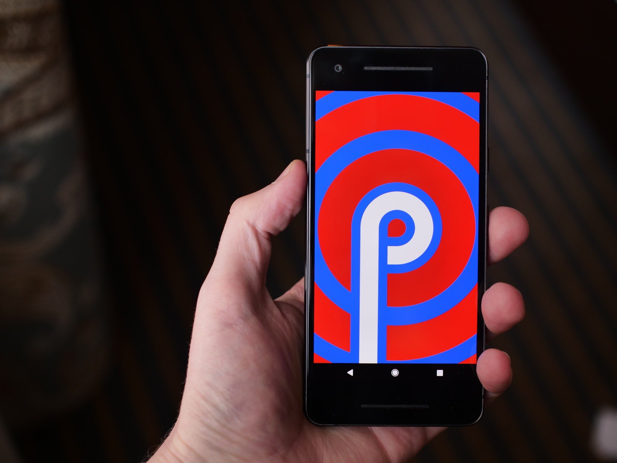
From new gestures to extending battery life, here's everything you need to know about Android P!
Following last year's Oreo release, 2018 is the year of Android P. We're still some time away before Google rolls out the new software to all users, but even in its current form, P is showing a lot of promise.
Things are bound to change leading up to Android P's official launch, but for the time being, here's everything you need to know about this year's big update.
The latest Android P news
July 25, 2018 — Google pushes Android P Beta 4
"Android P is almost here!" That's how Google starts its blog post introducing Android P Beta 4, which is available on all supported devices starting today.
According to Google, "Today's Beta 4 update includes a release candidate build with final system behaviors and the official Android P APIs (API level 28), available since Beta 2. It includes everything you need to wrap up your testing in time for the upcoming official Android P release." In other words, this is basically the same version that will ship to Pixels later in August, when the public version is released.
How to install Android P on your Pixel right now (or roll back to Oreo
July 20, 2018 — Android P engineers discuss dark mode, gestures, and more in Reddit AMA
Leading up to the official launch of Android P in about a month or so, the development team behind the new update recently got together for an AMA on Reddit to answer technical questions about P.
The dev team covered a ton of stuff, but there are a few highlights worth pointing out here. First off, when it comes to Android P's gesture navigation, they had this to say:
We evaluated many, (MANY!) options for navigation as part of this overall change to the system spaces (worth noting that our main impetus was about making All Apps/Overview more accessible from wherever you are in the system, similar to the notification shade). HOME and BACK are so central to Android navigation (both the system and the apps) - that ensuring the dependability of them via buttons with enough space led us to the current design. All that said - we really value both the aesthetic and functional appeal of a smaller nav bar / more gross-gesture navigation and are continuing to explore opportunities to bring that in.
A system-wide dark mode has also been on the minds of many, and to not much surprise, it was said that Google doesn't "have anything to announce about a unified dark mode."
The team also explained how maintaining Project Treble is actually more difficult than past efforts, said a fix is coming for Android's awful sharing menu, and more.
Read through the full AMA here
All the big details
Android P is officially Android 9
As spotted in the third developer preview, Android P is Android 9. This signifies that Android P is a big upgrade from 8.0 Oreo, and based on what we're about to dive into, we've got no problem agreeing with that.
It completely changes Android's navigation system
Back in 2011 with Android 3.0 Honeycomb, Google introduced Android's iconic three button navigation system we've come to know and love – Back, Home, and Recents. Seven years later with Android P, these are being eliminated in favor of a gesture-based system.
Android P is the first time Google's heavily relying on gestures for navigating the UI, and in their current form, they work as follows:
- Tap the Home button/pill to go home
- Swipe up to access the recent apps page
- Swipe up twice or do a long swipe for the app drawer
- The Back button only appears in certain apps/menus when it's needed
This combination of taps and swipes is a bit confusing right now, but we're expecting Google to roll-out a more refined version of this in later Developer Previews or in the final build. You can still use the traditional three buttons in Developer Preview 2 and 3 if the gestures aren't your thing, but it's rather obvious that this is the future Google wants for Android.
Android P's gestures are a jagged pill you should learn to swallow
The user interface is more rounded and colorful
Android P isn't as drastic of a visual change like we saw with the jump from KitKat to Lolipop, but compared to Oreo, there are some elements that are noticeably different.
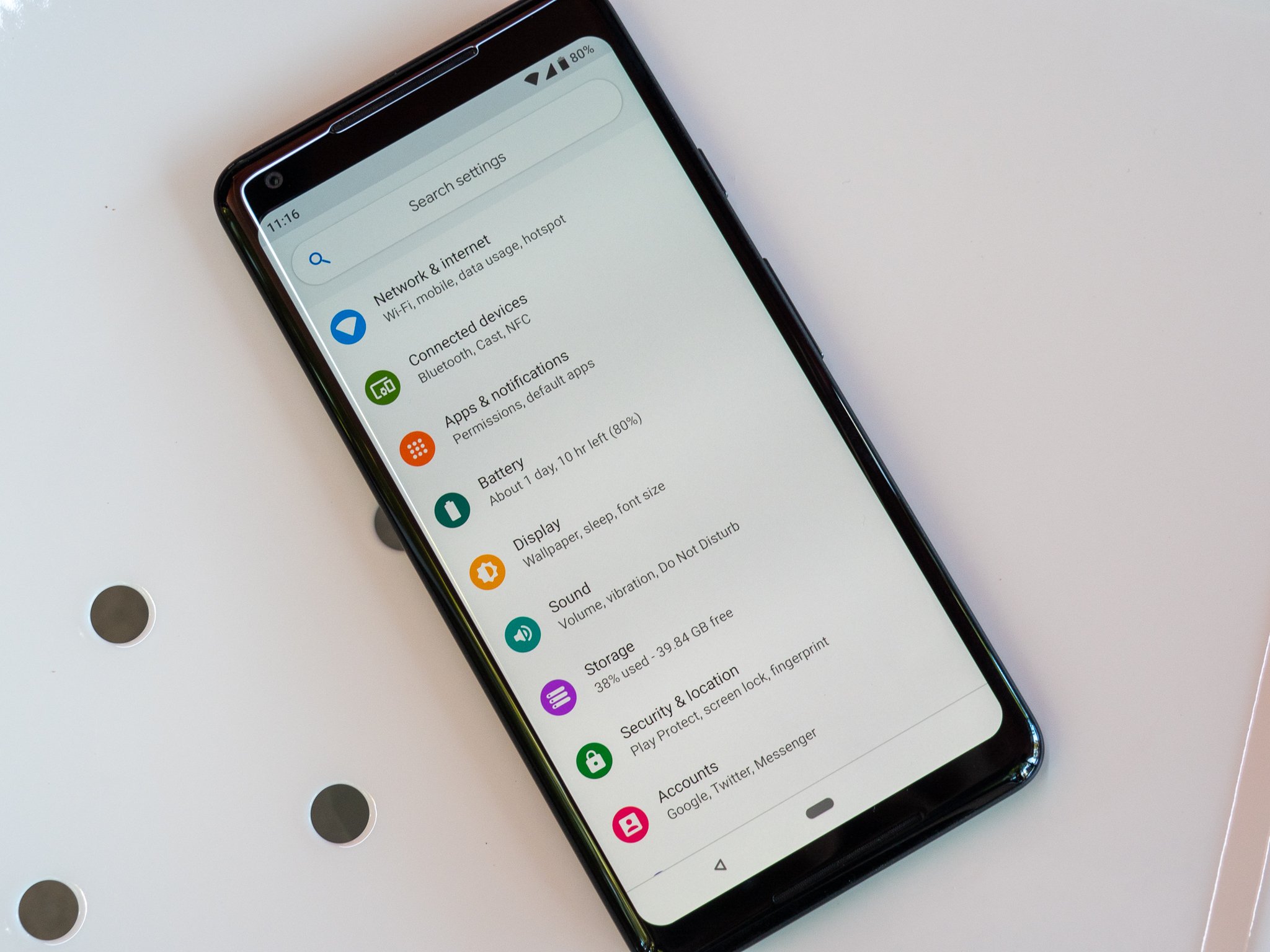
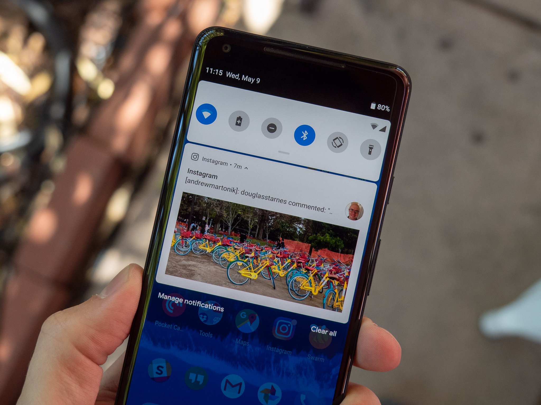
At first glance, things like the colorful icons in Settings, circular Quick Settings icons, and rounded corners for just about every menu jump out like a sore thumb. These elements do take some getting used to, but I ultimately came around to liking them quite a bit.
Something else you'll notice with Android P is just how alive it feels. Between the new gestures and updated animations, Android moves in a way that I've never seen before. Oreo was smooth and buttery, but Android P flies underneath your fingertips in a way that can only be experienced in-person.
There are tools for helping you use your phone less
Google talked a lot about helping people with their "digital wellbeing" at this year's I/O conference, and a lot of those efforts are baked right into Android P.
Although not live in Developer Preview 2 or 3, later versions of Android P will introduce a new system called Android Dashboard. Android Dashboard will offer a quick glimpse into how you're using your phone, including stats on which apps you're using the most, how many times you've turned on the screen, how many notifications you've received, and how much time you've spent on each app.
You'll also find a feature called App Timers that'll restrict you from using a certain app after you've spent x amount of time on it, as well as tools for easily turning on Do Not Disturb and switching your screen to a monochrome color palette to help you wind down for bed.
Google's 'digital wellbeing' initiative feels incomplete and insincere
Google's trying to squeeze as much juice as possible out of your battery
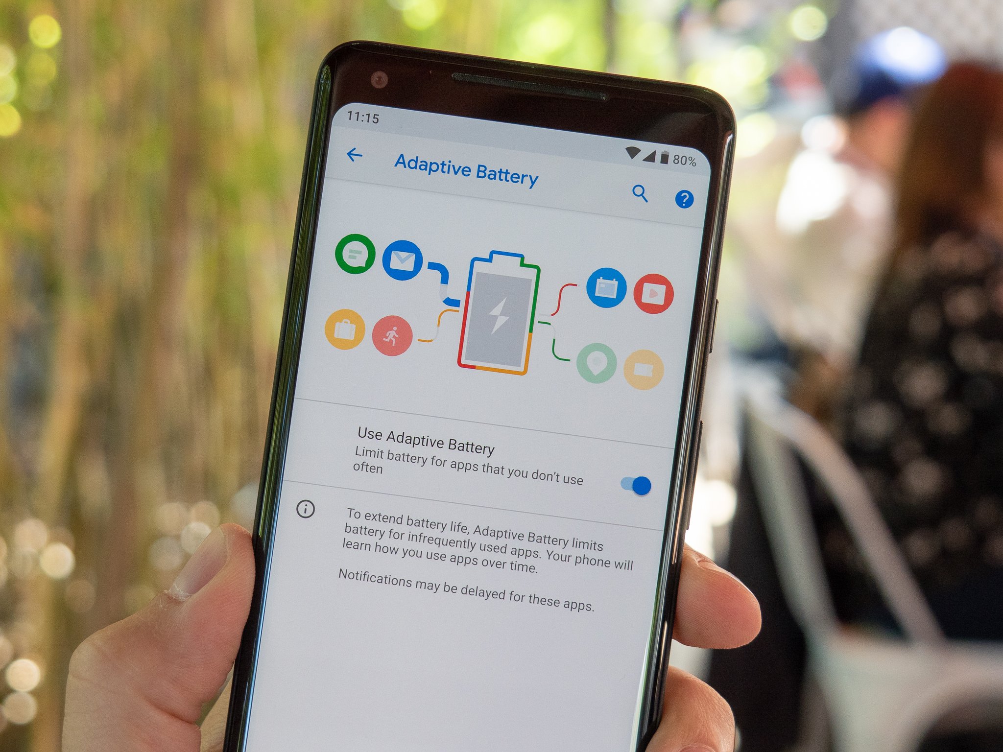
It seems like Google's always trying to find ways to maximize your phone's battery life as much as possible, and with Android P, those efforts are present in a new Adaptive Battery mode.
Similar to how Adaptive Brightness automatically adjusts your display's brightness level based on your environment and usage, Adaptive Battery will examine how you use your phone and limit CPU usage to apps you infrequently use.
Google notes that Adaptive Battery can lower CPU usage by as much as 30%, and thanks to the use of Machine Learning, it'll only get better the more you use your phone.
App shortcuts are everywhere
With Android Nougat, Google introduced us to App Shortcuts for the first time. Holding down on an app icon to quickly access certain elements of it can be genuinely useful at times, and with Android P, Google's taking these to the next level with App Actions and Slices.
App Actions will try to determine what you'll do next with your phone and give you recommend shortcuts for doing so within the app drawer, Assistant, and more. For example, if you watch Good Mythical Morning each day with breakfast, you might see an App Shortcut in your app drawer for searching Rhett and Link on YouTube during the morning.
On the other hand, Slices will allow you to perform more complex actions from the Assistant or Google Search. In the example Google gave at I/O, searching "I want to book a ride" will give you a special link to call a ride home via Lyft (assuming you've got the app installed).
157 new emoji
In Developer Preview 3, Google added a ton of new emojis to keep your conversations bright and colorful — 157 of them, to be exact.
Although we won't run through the entire list, some of the highlights include red hair, superhero, face with three hearts, bagel with cream cheese, mooncake, lobster, and llama.
There are also improvements to existing emoji, including two new gender-neutral family and couple designs and updated looks for the bacon, salad, turtle, and cricket emojis.
A new standard for biometric authentication
Fingerprint sensors and face unlock systems make it easier than ever to access private information on our phones, and in Android P Developer Preview 3, Google added a brand-new standard for this called "BiometricPrompt API."
Thanks to the new API, developers no longer have to create their own dialog for using biometric systems with their apps. This isn't something you'll notice in day-to-day use, but it's an important background change we're more than happy to see.
All the little things
In addition to the big changes found in Android P, there are a ton of smaller elements also scattered throughout the update. Some of my favorites include:
- Built-in screenshot editor
- Zoom pop-up when highlighting text
- Changing the volume now defaults to your media volume
- Volume controls appear on the right of your screen instead of the top
- Do Not Disturb is more customizable and easier to understand
You can sign up for the beta now
Similar to last year's Oreo beta, anyone with a Pixel phone can opt-in to the Android P beta right now to get an OTA update to download and play with the new software.
However, Google's Pixel phones aren't the only ones that get to have fun with this early access. Google's opening up its Android Beta Program to third-party OEMs for the first time ever thanks to Project Treble, including Nokia, OnePlus, Sony, Essential, Xiaomi, Vivo, and Oppo.
How to get Android P on your Pixel right now (or roll back to Oreo)
The official build should be released in August
If you'd rather not mess with the beta and just wait for the final version to drop, we're not too terribly far out from it.
Google notes that the final release for Android P will be published in Q3, and based on the above timeline and Oreo's release schedule, we should see Android P get a proper launch at some point in August.
Updated July 25, 2018: This article was updated with news of Android P Beta 4.
from Android Central - Android Forums, News, Reviews, Help and Android Wallpapers https://ift.tt/2vv60Vh
via IFTTT


No comments:
Post a Comment