The Note 10+ has a gorgeous new design and several hardware upgrades, but it also misses the mark in a few areas.
Samsung traditionally rolled out its latest features to the Note series, but that has changed in the last two generations as the manufacturer consolidated the design aesthetic and feature-set between its two flagships. The Galaxy S series introduced the exciting new features — such as the Infinity Display and new camera tech — while the Note device that followed included a few tweaks, a larger screen, and a stylus.
With the Note 9 in particular, it was clear that Samsung was positioning its stylus as the main differentiator between the Note series and the Galaxy S line, given the fact that the underlying hardware and the camera modules were unchanged between devices.
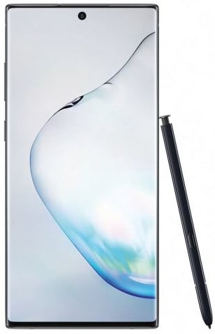
The Note 10+ builds on the same ideals as the S10+, but there are more substantial changes this time around. The cutout for the front camera is at the center of the screen, and the back has a gradient finish. Samsung has finally updated its charging standard, with the phone now offering 45W wired charging over USB PD. The screen is obviously larger — the Note 10+ is big in every sense of the word — and the stylus is back, picking up a few new features.
And for the first time on a Samsung flagship, there's no 3.5mm jack. The omission of the analog jack is a divisive move, but the industry has been going in that direction for several years now. Let's see if the Note 10+ is deserving of its hefty price tag.
Bigger and better
Samsung Galaxy Note 10+
All that refinement comes at a price.
The Note 10+ is a more refined version of the Galaxy S10+ with a larger battery, a more efficient chipset, 45W charging, and the S Pen. The gradient design is a welcome change, the centered cutout isn't as annoying anymore, the AMOLED panel is the best you'll find on any phone, and the performance is outstanding. The core experience is largely unchanged between both devices, but there isn't a 3.5mm jack anymore. At the end of the day, picking up the Note 10+ is based on how much you care about the stylus.
The Good
- Stunning AMOLED display
- 45W charging with all-day battery life
- S Pen is a standout feature
- Top-notch performance
- Gorgeous design
- Cutout isn't annoying anymore
The Bad
- No headphone jack
- Expensive
- Unwieldy
- Power button is on the left
About this review
I am writing this review after using the Exynos 9825 variant of the Galaxy Note 10+ for over a week in Hyderabad, India. The phone was connected to Airtel's 4G network for the duration of the review, and received a single update (N975FXXU1ASH5) containing the August 2019 security update.
Galaxy Note 10+: Hardware
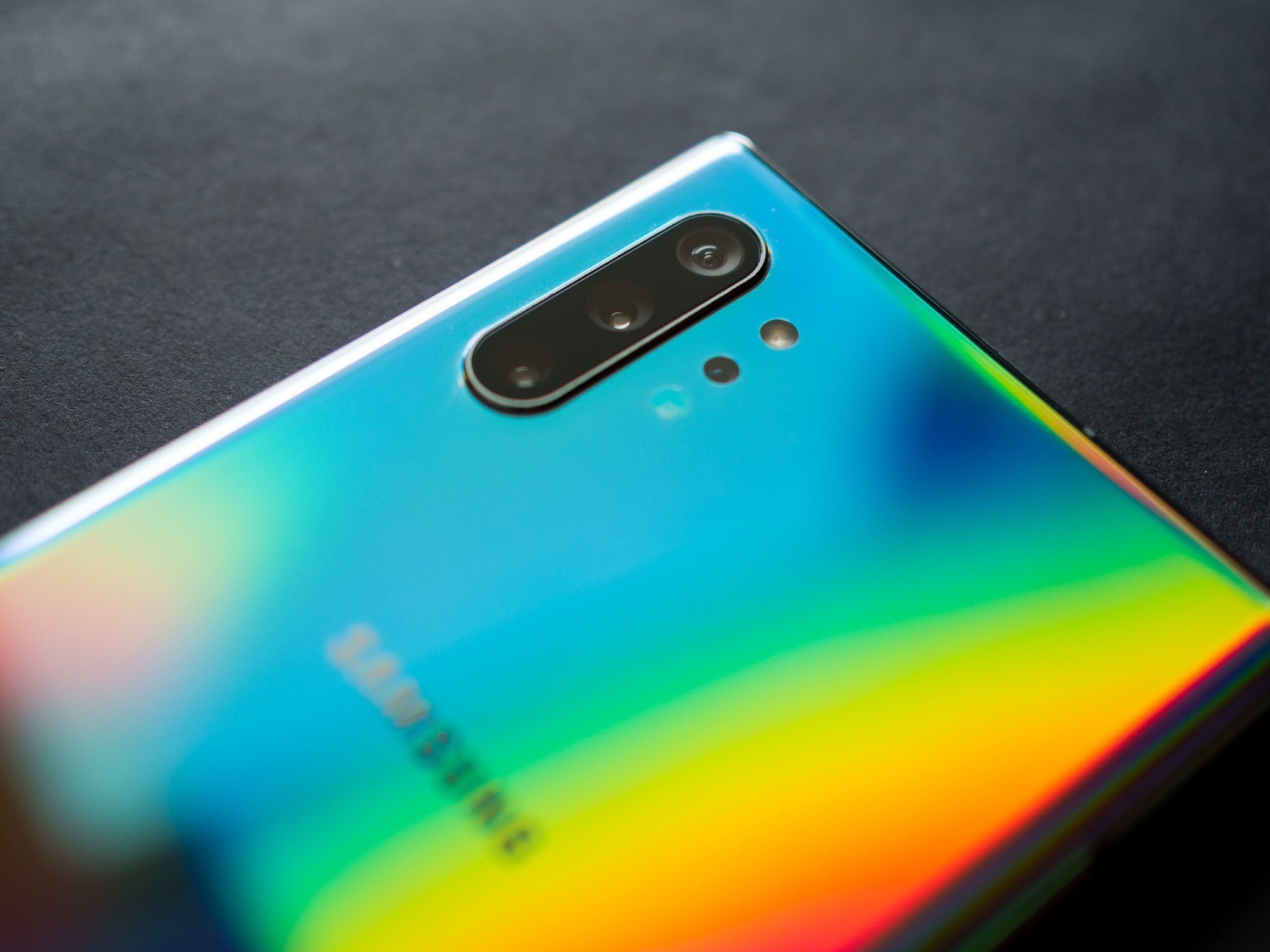
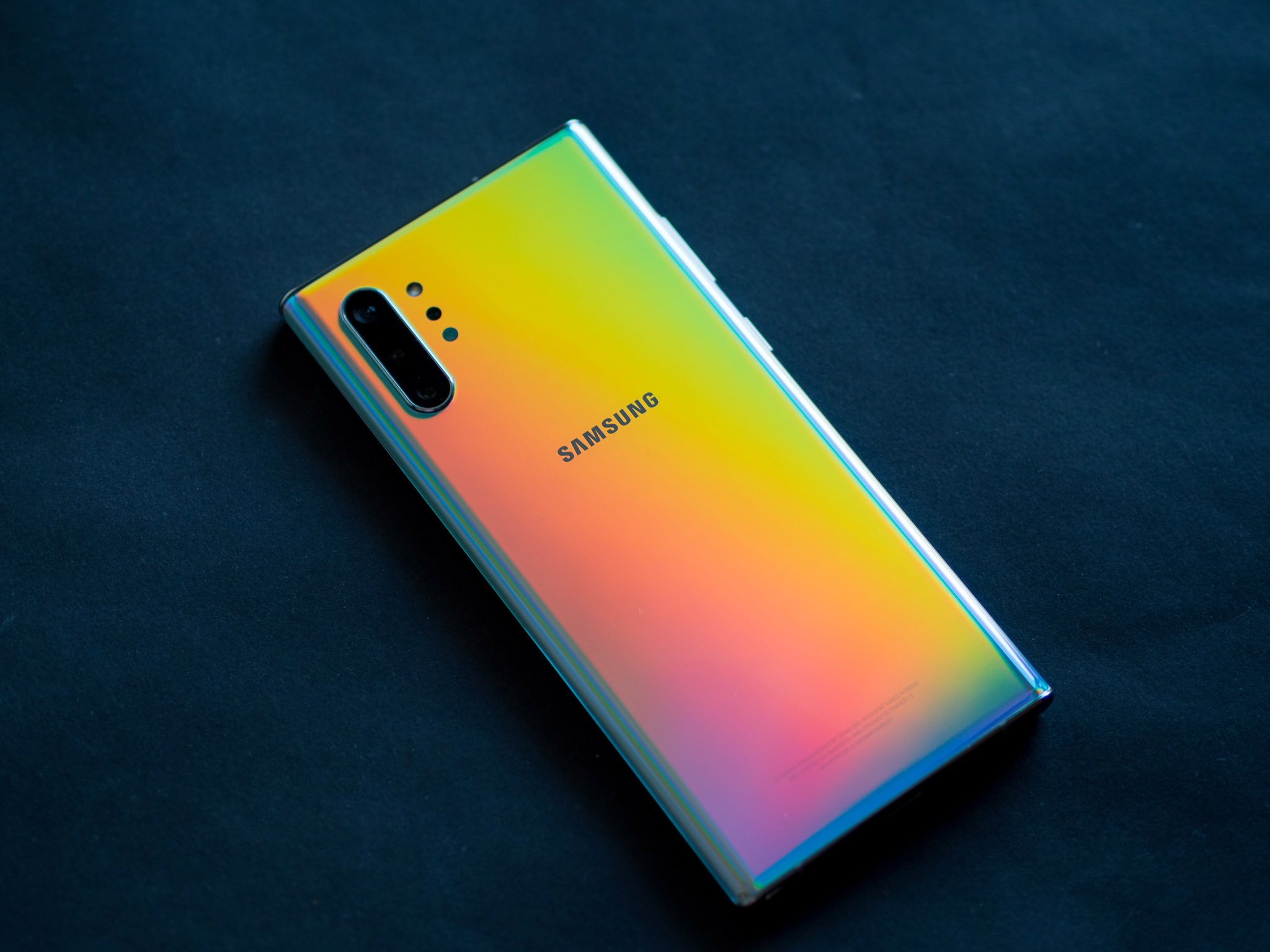
Samsung hasn't altered its design aesthetic for a few generations, but the Note 10+ has a few notable additions. There's the gradient design at the back, which looks stunning. I'm using the Aura Glow option, and it has an iridescent effect that shifts colors wildly in various lighting conditions. Samsung has offered gradient designs on its A series devices this year, but the effect on the Note 10+ is on another level altogether. This is what Samsung needed to do on the design front to meet the likes of the P30 Pro and other Chinese flagships. If you don't care for the gradient design, you can always pick up the Aura White or Aura Black models.
The Note 10+ is marginally taller (0.4mm) and wider (0.6mm) than the Note 9, but more importantly, it is 0.9mm thinner and 5g lighter in spite of offering a larger 4,300 mAh battery. Samsung switched to a stacked layout for the mainboard this time around, allowing it to pack the internal components much more efficiently. Considering the Note 10+ comes with a 6.8-inch display that's 0.4 inches larger than the one on the Note 9, it is a pretty significant achievement.
Another commendable design feature is the bezels, or lack thereof. Samsung significantly trimmed the top and bottom bezels on the Note 10+, and when combined with the curved screen and massive 6.8-inch display, the Note 10+ is about as immersive as it gets. The Note 10+ still has a dual curved screen — with symmetrical curves at the back — and there's a metal mid-frame made out of stainless steel. Both the front and back glass panels are protected by Gorilla Glass 6, and like its predecessor, the Note 10+ is a fingerprint magnet.
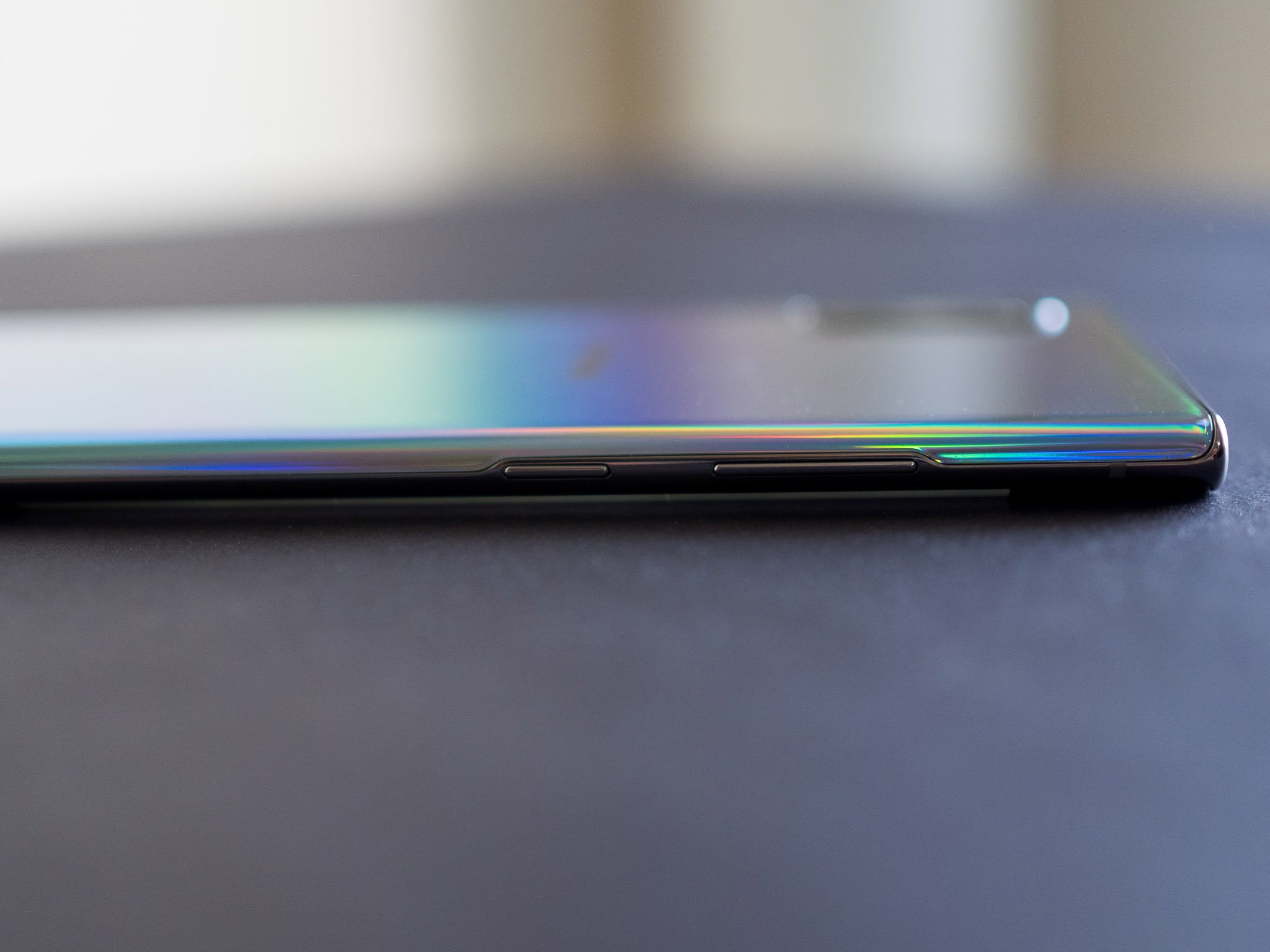
The thin profile combined with the dual curved design looks stunning, but there isn't much to hold onto at the sides.
Because of the thinner design, there isn't a whole lot of the metal frame on the sides — it's now just a tiny sliver in between the two panes of glass, and Samsung actually had to cut into the curve at the back to accommodate the power and volume buttons. The thinner profile and wider design makes the Note 10+ one of the most unwieldy phones I've used to date.
There just isn't enough hold onto at the sides, and while the overall design is an engineering marvel, it isn't the most conducive for day-to-day usage. You will need to buy a case with this phone; thankfully, there's a clear case bundled in the box, and there are tons of great options available. Samsung also switched the layout of its buttons with the Note 10+, with the power button now located on the left, just below the volume rocker. That was where the Bixby button was last year, and I don't understand why Samsung decided to switch the position of the power button.
Virtually every other phone has the power button on the right, and I essentially had to ignore years of muscle memory and learn to use the button on the left to wake the screen. This is a phenomenally dumb move, and one that still irks me after using the phone for a week. There's no logical reason for Samsung to do this — it could have come up with a better alternative. But as we've seen often enough in the past, it chose to go with the easiest option available. Furthermore, the power button itself isn't nearly tactile enough and feels a bit wobbly at times, which is inexcusable for a phone that costs $1,100.
It was a phenomenally dumb move to get rid of the headphone jack and switch the power button to the left.
Rounding out the design, the USB-C port is at the bottom, with the primary speaker located next to it. Next to that is the housing for the S Pen, and up top you'll find the SIM card tray. A notable omission is the 3.5mm jack — Samsung has been the only major Android player left to still include a headphone jack in its flagship, but that run has now come to an end.
For what it's worth, you do get AKG buds in the box now come with a USB-C connector, and they sound identical to the ones bundled with the S10+. But you're out of luck if you want to use your wired audio gear, as there's no USB-C to 3.5mm dongle in the box.
The lack of a 3.5mm jack goes against the very ethos of the Note line — over the years, the Note series stood out because it was the default choice for power users, offering every single feature possible on a phone. But with the industry as a whole moving away from the 3.5mm jack, it was inevitable that Samsung would one day follow suit.
Four cameras at the back, IP68 dust and water resistance, and 15W wireless charging.
On the subject of change, Samsung also switched the position of the camera cutout, with the module now centered at the top of the display. This is a more welcome change as the cutout no longer interferes with the network or carrier status icons. The cutout means you don't get the same all-screen design as a phone with a pop-up module, but the overall design is a definite improvement over the S10+. At the back, Samsung has opted to stick with the same modules as the Galaxy S10+, but there is a fourth DepthVision sensor that's used for creating 3D models of objects. But more on that later.
Unlike the past few generations of Samsung flagships, the camera sensors are arranged vertically, and they're now located on the top left corner. The camera housing has a slight bump, but it doesn't make the device wobble when laid flat on a surface.
Samsung introduced an ultrasonic fingerprint reader on the S10+, and the Note 10+ features the same module. I didn't have any issues with authentication, but the module itself now sits slightly higher up than it did on the S10+, so it takes a few days to get acclimated to the new position. There's also software-based face unlock that worked just as well as the S10+.
Like the S10+, the Note 10+ features stereo sound, with the tiny grill at the top of the display housing the secondary speaker. There's also a hole next to the SIM card slot at the top of the device that emits sound, and the overall sound quality is fantastic. Other features that have allowed Samsung flagships to stand out over the years are back: there's IP68 dust and water resistance, and 15W wireless charging.
The best display you'll find on any phone today
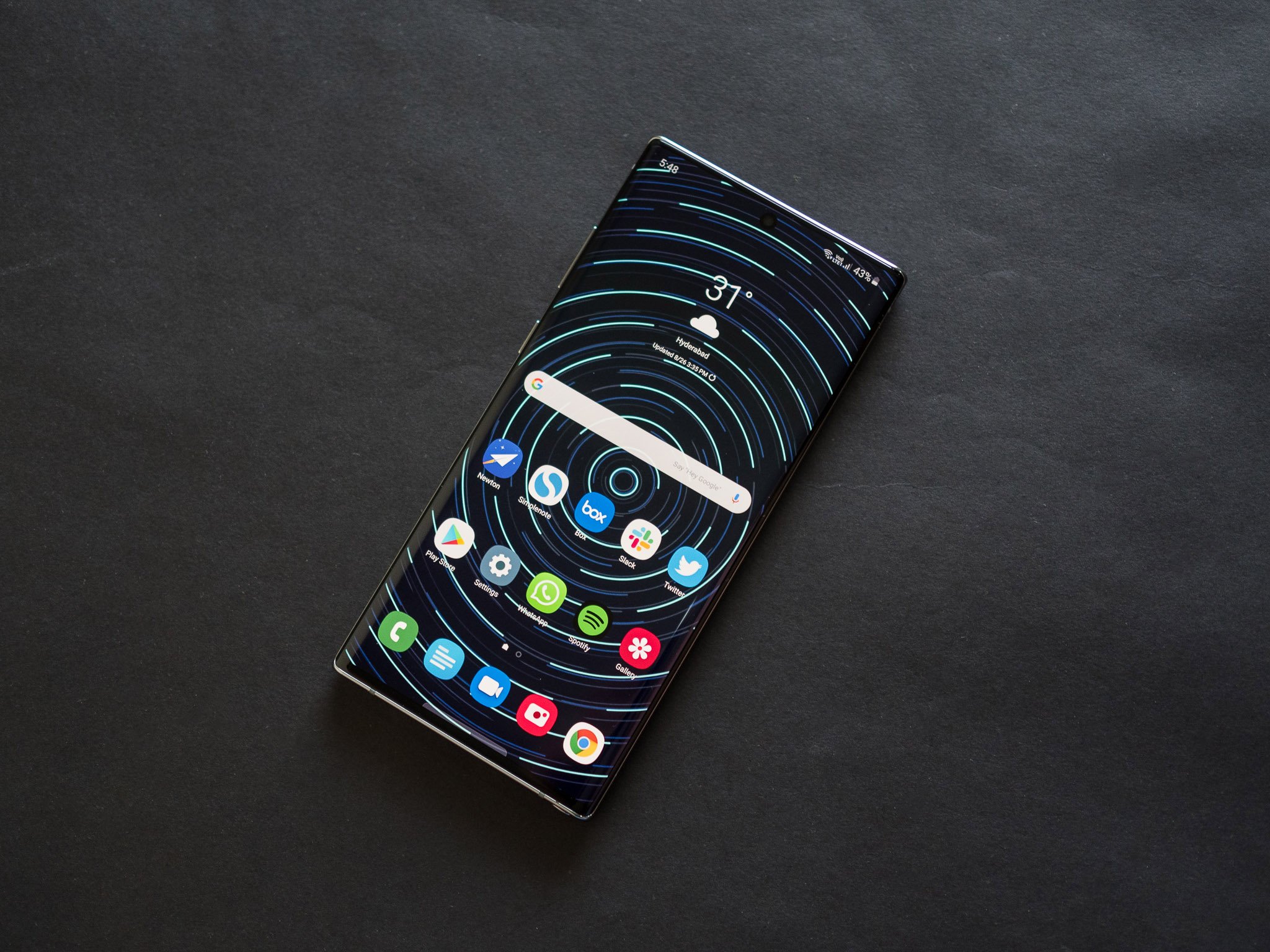
Samsung continues to push the boundaries for display tech year after year. The company has managed to consistently roll out better panels with every generation, and it's effectively competing against itself at this point. As I said a few times over the last two years, Samsung is the undisputed king of the display market, and that's evident once you start using the Note 10+.
Year after year, Samsung continues to push the boundaries for display tech.
The Note 10+ features a massive 6.8-inch Dynamic AMOLED with a QHD+ resolution (3040 x 1440), leading to a pixel density of 498ppi. Colors are vibrant, the contrast levels are excellent, and you get HDR10+. In short, this is the best display on any phone today, and combined with the stereo speakers make the Note 10+ a fantastic device for consuming media on the go.
I didn't face any issues with sunlight visibility either. The panel on the Note 10+ gets sufficiently bright in auto mode that it wasn't a problem reading the contents on the screen under harsh sunlight. Furthermore, I don't mind the fact that the display is limited to 60fps. I'd take a higher-quality panel over 90Hz refresh rate any day, and as good as the display is on the OnePlus 7 Pro, you don't get to take advantage of the high refresh rate in most games.
Exynos 9825 is a step in the right direction
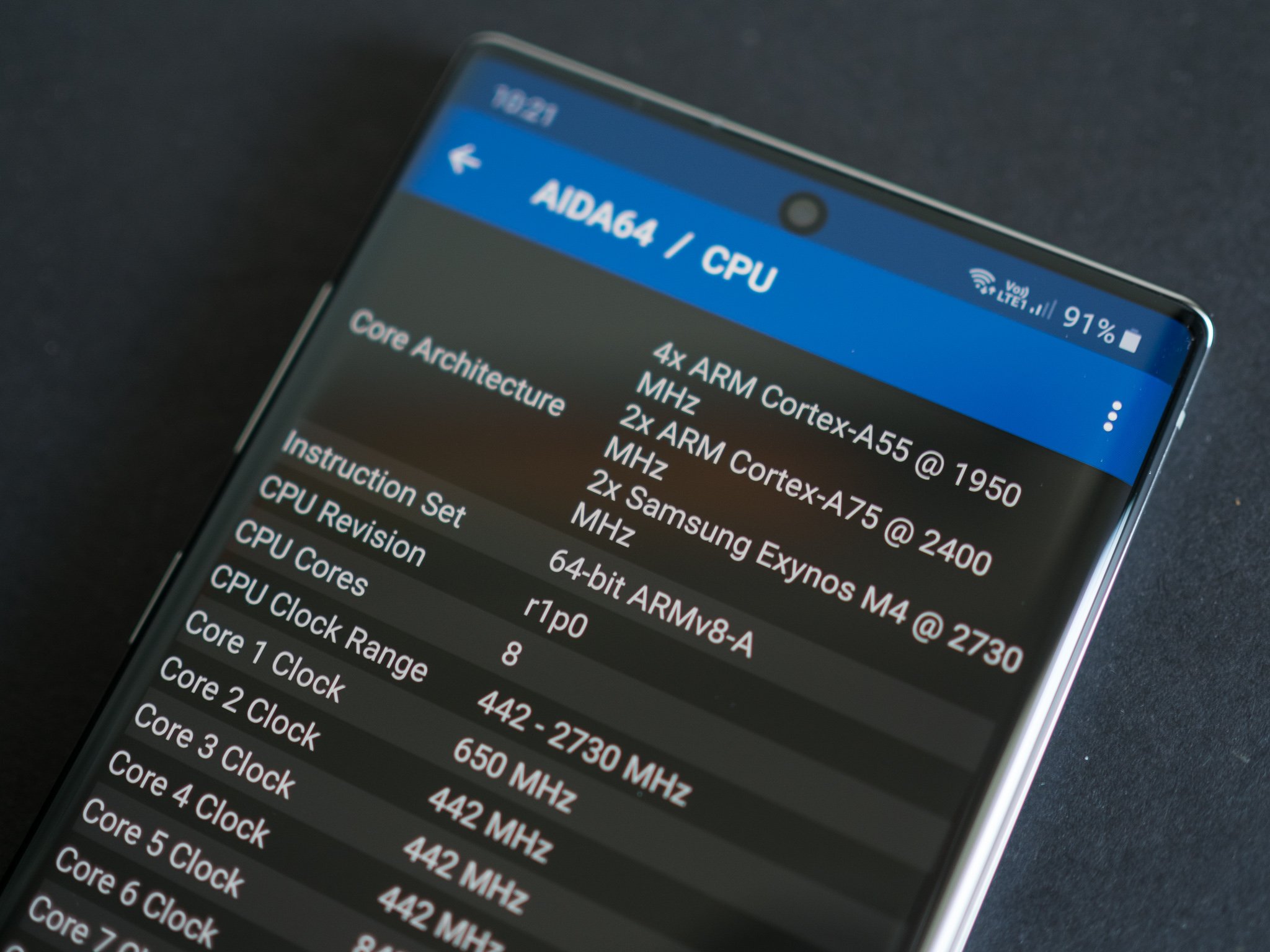
With the Note 10+, Samsung has switched to a 7nm chipset for the first time. The Exynos 9820 that was featured in the Galaxy S10+ was on an 8nm node, and while the Exynos 9825 has the same underlying architecture and core arrangement, the node shift to 7nm results in better energy efficiency.
As a refresher, the Exynos 9825 has the same tri-cluster core configuration as its predecessor: there are two Samsung-made custom M4 cores clocked at 2.73GHz that do the heavy lifting, backed by two Cortex A75 cores at 2.4GHz and four energy-efficient Cortex A55 cores that go up to 1.9GHz. Overall, the shift to a 7nm node is a welcome move. Samsung was the outlier in that it was the only foundry to roll out an 8nm chipset, with Qualcomm and HiSilicon switching to 7nm for their flagship designs for 2019. With Samsung also making the switch, all three major mobile chipsets are on the same node.
With 12GB of RAM and a more energy-efficient 7nm Exynos 9825, you're not going to see any slowdowns.
There weren't any performance issues on the Exynos 9820, and that's true of the Exynos 9825 as well. The M4 core in particular provides the best single-core performance you'll find on Android today, but in multi-core tests the Exynos 9825 loses out to the likes of the Snapdragon 855.
The result is that the Note 10+ is just as fast as other flagships like the P30 Pro, and the UI in particular has come a long way in the last 18 months. Sure, Samsung likes to stuff the interface full of features you're not going to end up using, but at least it's very well optimized.
I didn't see any slowdowns whatsoever in the week I used the Note 10+, and while Samsung flagships in the past had a tendency to slow down after a few months of use, that is no longer the case. The Note 9 held up just fine after three months of usage, and it's still a solid option today. Same goes for the Galaxy S10+. Cellular connectivity was also stellar, and I had no issues receiving or making calls. The Note 10+ also had zero issues with Wi-Fi connectivity, and it is only the second phone to come with a Wi-Fi ax modem, making it future-proof.
With the Note 10, Samsung is also offering two sizes for the first time. The Note 10 the default option if you're looking for a more compact device, but it has an FHD+ panel, just 8GB of RAM and misses out on the MicroSD slot. The Note 10+, meanwhile, comes with 12GB of RAM, a stunning QHD+ AMOLED display, and a MicroSD slot. While the Note 10 is a better device from a usability point of view, you're getting much better hardware on the Note 10+.
All-day battery life with 45W charging
In addition to switching to a more efficient node, Samsung slotted a larger 4,300 mAh battery in the Note 10+. The last two generations of Exynos-based Samsung flagships had sub-par battery life, and although the Note 9 managed to last a day most of the time, it wasn't on par with its rivals. The Galaxy S10+ fared even worse than the Note 9 even though it had a 4,100 mAh battery.
That's why it's great to see Samsung address these issues with the Note 10+. The larger battery and the node shift to 7nm allow the Note 10+ to deliver all-day battery life without breaking a sweat, and there wasn't a single instance where I had to enable battery saver or worry about the battery running out before the end of the day.
I'm no longer worried about the battery running out before the end of the day, and 45W charging is a welcome addition.
I routinely got over seven hours of screen-on-time spread out over the course of a day. Even on days when I primarily relied on cellular connectivity, the Note 10+ managed to make it through to 11pm with a 15% charge left over. Sure, the battery life isn't on the same level as what you'd get on the P30 Pro, but it is a big improvement from the likes of the Note 9 and S10+.
After stubbornly sticking to 15W fast charging while the rest of the industry has moved on to 50W speeds, Samsung is finally making much-needed changes in this area. The Note 10+ can charge at up to 45W over USB PD, with the charger bundled in the box going up to 25W. The 25W charger is still decent enough to charge the battery from flat to 100% in just over 90 minutes, with a 30-minute charge resulting in a 60% charge.
The Note 10+ also has 15W wireless charging, and the PowerShare feature that debuted on the Galaxy S10+ is back, allowing you to charge other devices — like Samsung's Galaxy Buds and the Watch Active — wirelessly.
S Pen picks up a few new tricks
The S Pen is the standout feature on the Note 10+, and it hasn't lost any of its allure. You still get the ability to doodle on the screen, select a portion of the screen to take a screenshot, and create live messages with various effects, and there's now a new feature called AR Doodle. It basically lets you draw animations on your selfies, and it works with videos shot using the front camera as well. It does a decent job of it too, but I doubt anyone will end up using it more than once.
Air actions is another new feature that lets you assign actions to the stylus' button. You can set it to launch the camera, or select a particular action when you're in an app. For instance, if you're in the gallery, you can use gestures to navigate between photos, or assign the single and double press buttons to show more information about a photo. It is pretty nifty, and highly configurable.
Like last year, you can use the stylus as a remote shutter button, and this is what I ended up using most of the time. I also liked the handwriting recognition feature: it worked astonishingly well, and it was able to transcribe my notes, and do so accurately. All you need to do is jot down a note with the S Pen, and tap anywhere on the handwritten portion for the feature to automatically convert it to text.
Galaxy Note 10+: Camera
When it comes to the camera side of things, little has changed from the Galaxy S10+. Samsung is using the same three sensors, but there's a new DepthVision module for creating 3D scans of objects. There's a 12MP primary camera joined by a 16MP wide-angle lens with 123-degree field of view, and a 12MP telephoto lens with 3x zoom. And aside from better stabilization for videos, the final image quality is largely unchanged from the S10+.
The Note 10+ takes stunning photos in most lighting conditions, but it isn't quite on the same level as the Pixel 3 or the P30 Pro. But the wide-angle and zoom lens continue to be standout additions, and make the camera that much more versatile. Live Focus also does a great job with background blur, and the 10MP front camera takes decent selfies.
It's clear that Samsung is saving its camera innovations for next year's Galaxy S11 series, and that puts the Note 10+ at a disadvantage. Huawei is set to roll out the Mate 30 series later this year, and Google is similarly set to launch the Pixel 4. The Note 10+ isn't as good as current-gen flagships from Google and Huawei, and that gulf will only get wider once we see what either brand has to offer later in the year.
Galaxy Note 10+: Software
Samsung overhauled its software skin last year, with One UI offering a more modern aesthetic with white interface elements and blue accent colors. The Note 10+ is running One UI 1.5 based on Android 9.0 Pie, and it is on the latest security update.
One UI is not laggy anymore, and you get more features than you'll end up using.
Usability is a major area of focus with One UI, with interface elements sliding down to make it easier to access menus one-handed. This is evident in the notification shade: it slides all the way to the bottom of the screen, allowing you to reach the toggles without having to maneuver too much.
While Samsung has polished the user interface, it continues to offer more features than you'll end up using. There honestly is a lot going on here, and it usually takes an hour during initial configuration to set things up the way you want. I like the level of customization on offer, but Samsung doesn't necessarily make it easy to just get started with the phone. In this regard, I like OxygenOS better.
Samsung Pay continues to be a delight to use, and while the feature hasn't necessarily picked up any updates in a while, it excels at mobile payments.
Galaxy Note 10+: Bottom line
The Note series has always been about zero compromise, but that's no longer the case with the Note 10+. The lack of a 3.5mm jack is going to be a deal-breaker for a subset of the community, but if you're willing to look past that, there's a lot to like here.
The display is once again the best on any phone today, and Exynos 9825 can hold its own against the best that Qualcomm and Huawei has to offer. The 4,300 mAh battery finally delivers decent battery life, and the switch to 45W wired charging is a welcome move.
With 12GB of RAM, 256GB of UFS 3.0 storage, that stunning HDR10+ panel with stereo sound and a bezel-less design that is cutting-edge, the Note 10+ should easily last a few years without any issues. The only point of worry is around the camera: Huawei and other Chinese brands are pushing the boundary for camera tech, and it feels like Samsung is languishing in this area. Don't get me wrong; the Note 10+ has a great camera that takes incredible photos, but it isn't the best out there. And that isn't what you'd want from a phone that costs over $1,100.
To sum it up, there's a lot to like in the Note 10+, but it does feel like Samsung's hasn't done enough — particularly on the camera front — to make the phone stand out from what Google and Huawei have to offer.
There are plenty of other options if you want a flagship phone in 2019. The Galaxy S10+ is still going strong, and is a great alternative to the Note 10+ if you don't care about the stylus. Then there's the Huawei P30 Pro — it is available in most markets where Samsung sells the Exynos Note 10+, and it costs several hundred dollars less while offering a better camera and two-day battery life.
Bigger and better
Samsung Galaxy Note 10+
All that refinement comes at a price.
The Note 10+ is a more refined version of the Galaxy S10+ with a larger battery, a more efficient chipset, 45W charging, and the S Pen. The gradient design is a welcome change, the centered cutout isn't as annoying anymore, the AMOLED panel is the best you'll find on any phone, and the performance is outstanding. The core experience is largely unchanged between both devices, but there isn't a 3.5mm jack anymore. At the end of the day, picking up the Note 10+ is based on how much you care about the stylus.
from Android Central - Android Forums, News, Reviews, Help and Android Wallpapers https://ift.tt/2Hu5mjH
via IFTTT










No comments:
Post a Comment