This unassuming wearable may not be the most powerful or pretty, but it gets the job done on limited resources.
Smartwatches don't have to be ultra-expensive status symbols; smartwatches can and do serve practical purposes. I may not be making calls on my wrist, but I do want to see why my phone keeps buzzing in my pocket as I walk around Walt Disney World — or just how many miles I'm walking — and a practical smartwatch at a practical price point is absolutely worth the investment. While the TicWatch E might not quite have the latest chips or the boldest look, it's a lifeproof watch that can do what you need without sucker punching your wallet on its way into your life.
Mobvoi TicWatch E2
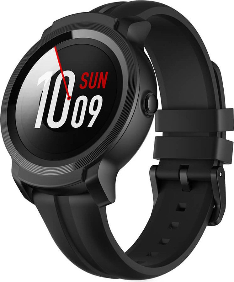
The E2 may not have the newest Snapdragon Wear 3100 inside, but with improved fitness tracking and more refined look, this watch is more than worth its modest price tag.
The Good
- More durable and understated design
- 5 ATM waterproofing
- Improved responsiveness & tracking
- Easily lasts 2 days with regular use
The Bad
- Noticeably bigger than first-gen TicWatch E
- No NFC for contactless payments
- No ambient light sensor, no auto-brightness
- 2 GB storage doesn't leave room for offline workout music
About this review
I have worn the black TicWatch E2 for two weeks before writing this review, and for the two months preceding the arrival of my review unit, I wore a white TicWatch E, which I reviewed a year ago. Both watches are paired to a OnePlus 6T, with Always-on screen disabled and Tilt-to-wake turned on.
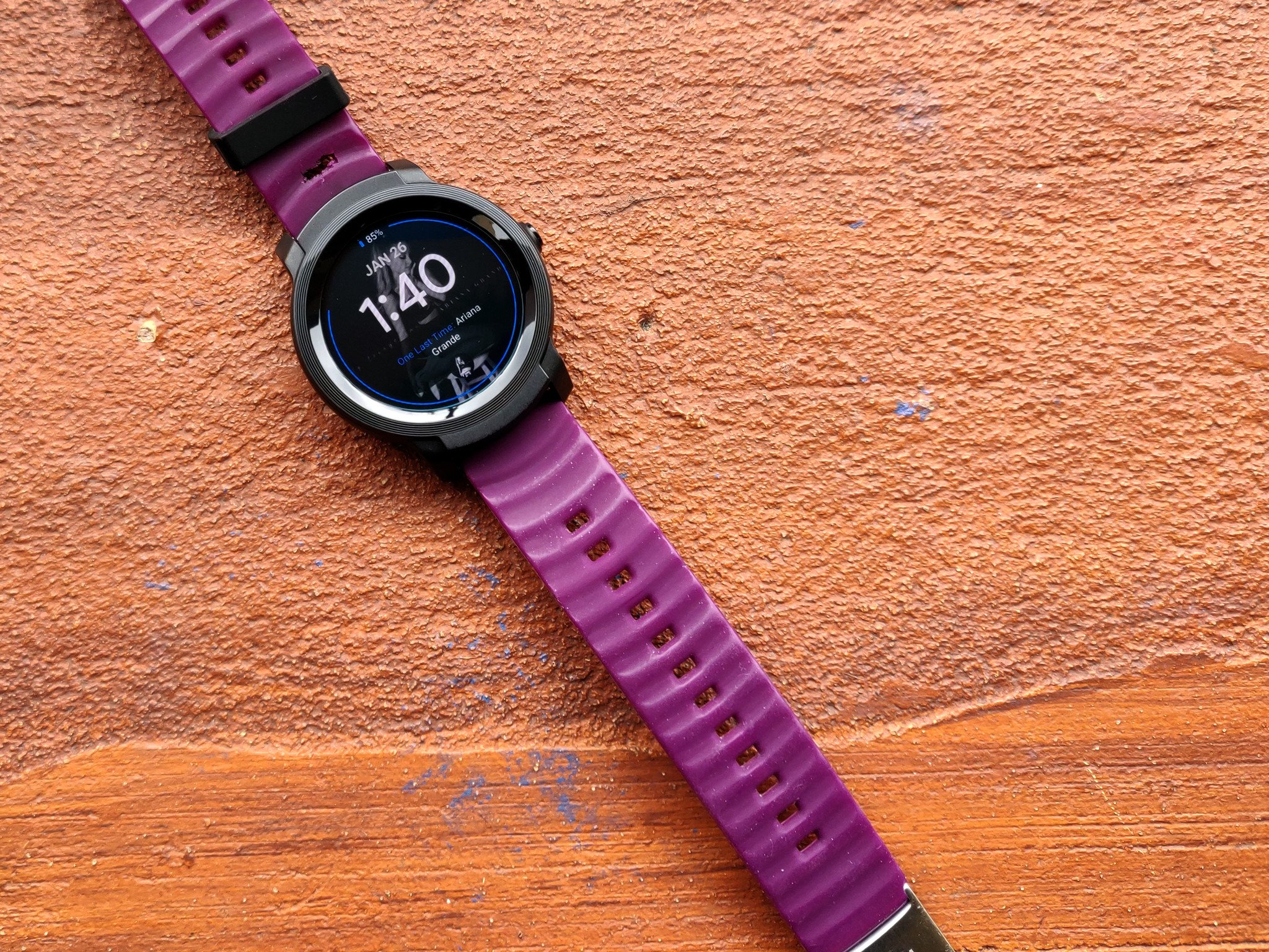
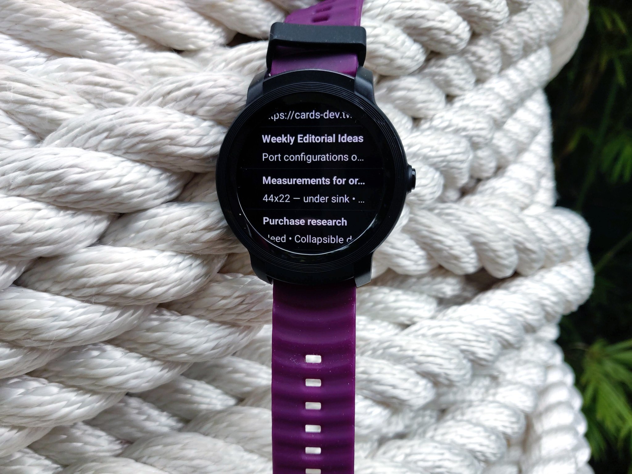
The band that came with the TicWatch E2 was too small for my wrist, so I swapped it out for an old TYLT silicone band I scavenged off my original Moto 360 (RIP, beautiful). The TicWatch Band is soft, flexible without being flimsy, and I would have absolutely used it if it had fit my underweight wrist.
Keeping up the pace
Mobvoi TicWatch E2 What fits like clockwork
The original TicWatch E featured a white body that was surrounded by a clear polycarbonate bumper, and it looked as cheap and odd as it felt. Thankfully, the E2 eschews this design for a solid black housing that looks and feels far better and sturdier, while remaining lightweight enough to effortlessly wear all day and all night. The E2 is a bit larger in width and thickness than the E2, but it's not a hulking shackle like the dual-screened TicWatch Pro.
Waterproofing and battery on the E2 are the two biggest upgrades this go around, and what a difference they make. After running around two theme parks for over 12 hours of a 20-hour day, with lots of time-checking, step-counting, and notification managing, the TicWatch E2 still had over 50% of its battery left, and most days I took the watch off before bed with more than 70% of its battery left. If I'm on a weekend trip and forget the charging cradle, I'm confident the E2 could last the whole weekend with Theater mode turned on at night and tilt-to-wake turned off.
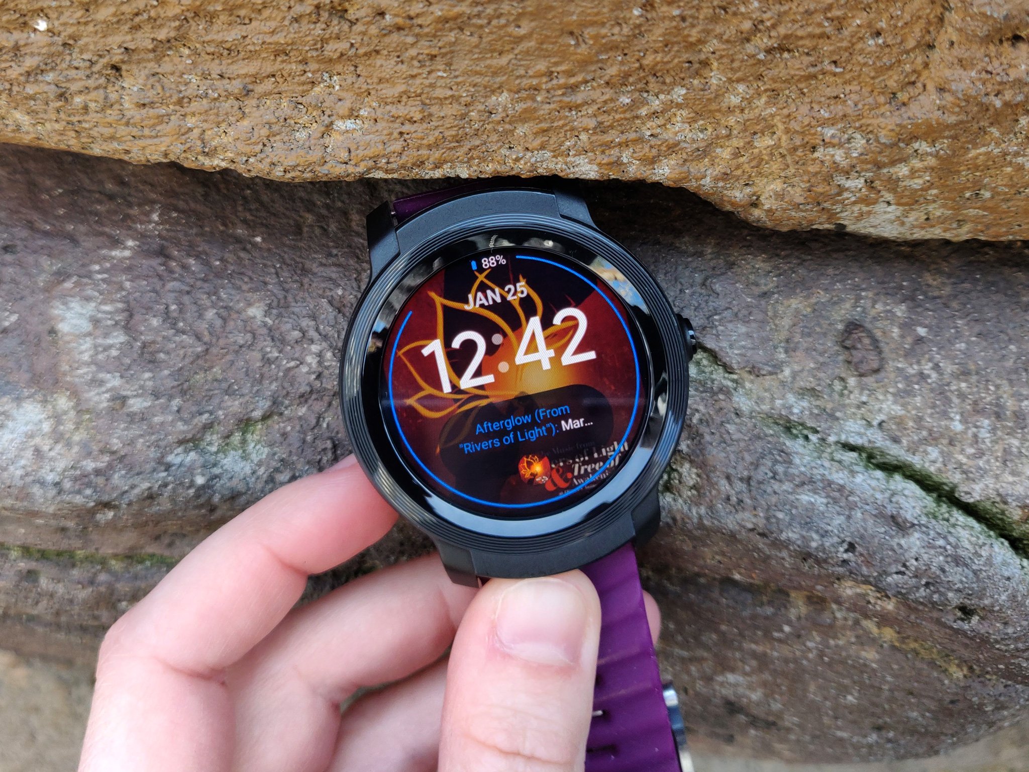
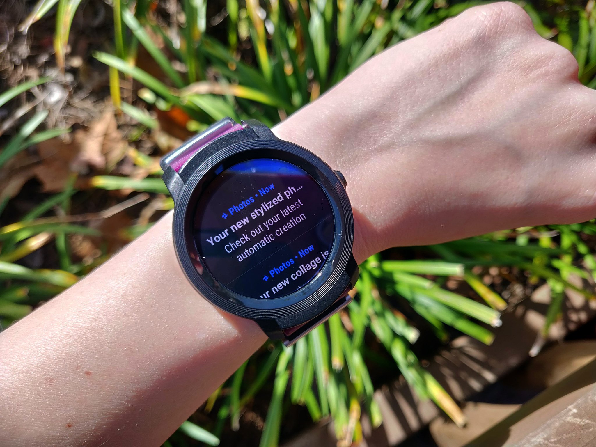
While I do wish that the dual-layer screen from the TicWatch Pro came on every smartwatch, the 1.4-inch screen on the E2 is easy to read and doesn't eat much battery (unless you're using Always-on display, of course). The E2's five brightness levels work well for dim nightclubs and bright, sunny afternoons, and though it looks washed out, I had no problems reading time or notifications off the TicWatch E2 in the harsh Florida sun.
When waking up the watch swapping menus, Mobvoi has done the best it can with the Snapdragon Wear 2100, and while loading up fresh data in Google Keep or RadarScope can take a second, Wear OS here feels pretty smooth overall.
Mobvoi TicWatch E2 What's long overdue
Two of my biggest complaints with the original TicWatch E sadly aren't solved with the TicWatch E2: there's still no ambient light sensor, and there's still no NFC for Google Pay. We've seen Google Pay in smaller watches than the E2, and while I'll admit I seldom use contactless payments even when I wear a watch that has NFC, it'd still be nice to at least have the option.
More of a letdown, however, is the thought that even with Mobvoi's years of smartwatch experience, the company continues to forego automatic brightness and the ambient light sensor it requires in a watch this size. Even if the Wear OS 2.0's Quick Settings makes adjusting the brightness easier, it's not something you have to do regularly on any smartwatch in 2019.
The specs are ordinary, but they're enough to get by.
When the TicWatch E2 and S2 were announced at CES, I was disappointed to see they weren't powered by the newer, more efficient Snapdragon Wear 3100 SoC, but last generation's Wear 2100 is still an upgrade from original E's MediaTek processor, and the E2 was noticeably more responsive than the E. The E2 also has about half the user-available storage as last year's model — 1 GB vs 1.85 GB — despite both watches have 4 GB is total internal storage, so don't plan on loading up a huge offline workout mix on here, but that's okay.
Mobvoi TicWatch E2
The TicWatch E2 is a definite upgrade from last year's model in performance, design, durability, and value. It's a good watch for what it is: a smartwatch on a budget. The E2 benefits from a more durable, dependable form and a more refined Wear OS 2.0 experience within, but the lack of automatic brightness, NFC, and any real standout features mean that this affordable wearable struggles to stand out in an increasingly crowded field of sub-$200 watches.
Mobvoi watches have been on my wrist for a year now, and while they might not be as sexy as Samsung's OLED screens or as down-to-the-stroke accurate as Fitbit's fitness trackers, they deliver my notifications, music controls, shopping lists, and activity levels without costing as much as most smartphones. The E2 fits my needs, my budget, and my understated look, and I'm ready for it to show me just how many miles I just walked around Epcot today.
from Android Central - Android Forums, News, Reviews, Help and Android Wallpapers http://bit.ly/2G0FyfS
via IFTTT
No comments:
Post a Comment