The Galaxy S9+ is great out of the box, but there's room for improvement.
Samsung decided to take a conservative route with the Galaxy S9 series, with the phones featuring the same design aesthetic as last year's Galaxy S8 while offering a few select upgrades. The camera now sports variable aperture, the Quad HD Super AMOLED display is 15% brighter, and the devices feature the latest hardware in the form of the Snapdragon 845 and the Exynos 9810.
Essentially, the Galaxy S9 series is a refined version of last year's flagships, with improved cameras and minor design tweaks. That said, there's still room for improvement in a few areas. Here's what I'd change in the Galaxy S9+.
Decoupling the fingerprint scanner
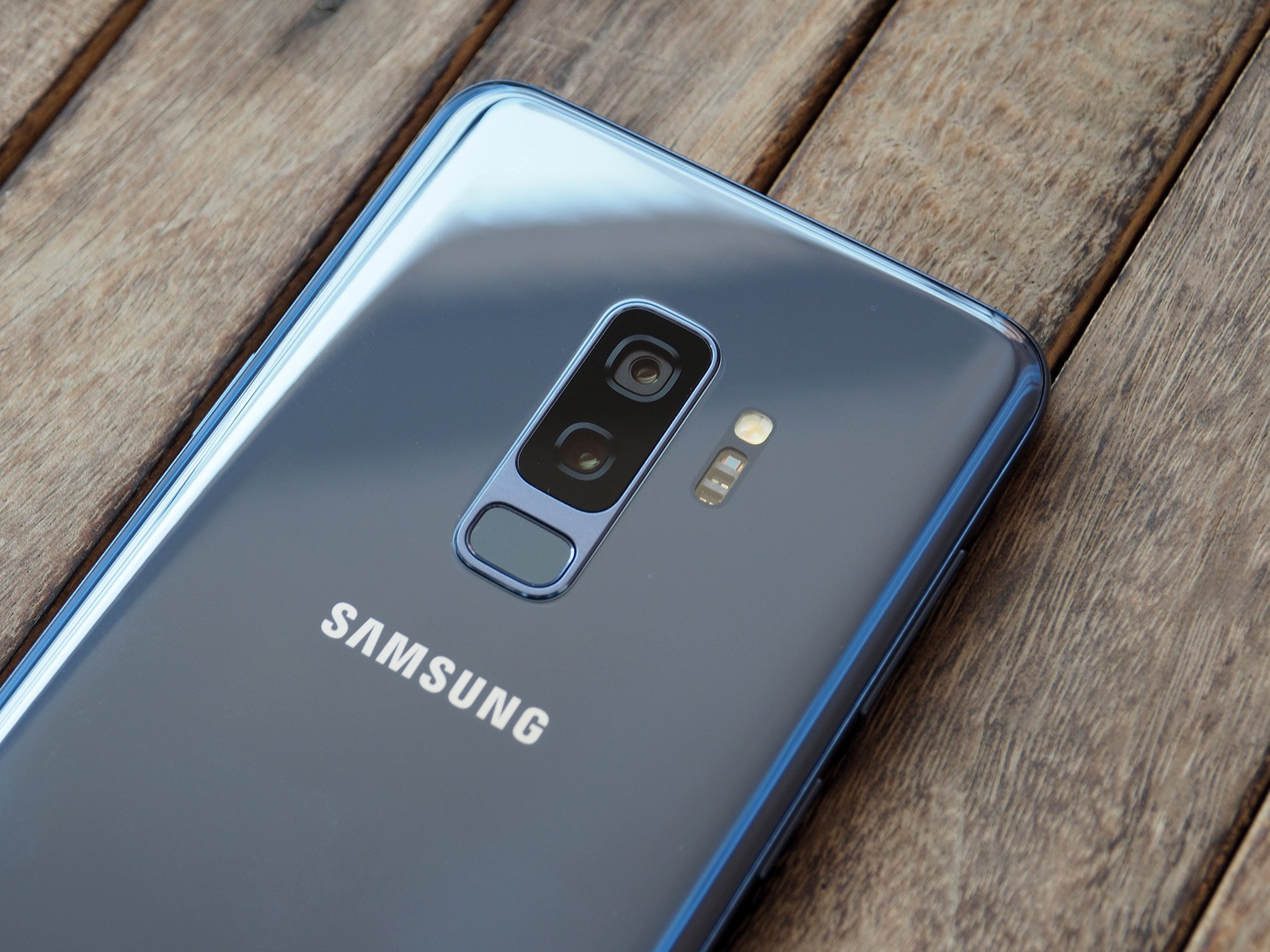
Located underneath the camera module, the fingerprint sensor is at a much more sensible location when compared to last year. However, Samsung stuck with the same rectangular housing as the Note 8, with the sensor attached to the camera module. Only this time around, the camera sensors are arrayed vertically.
While the move makes it easier to reach the scanner — particularly on the larger S9+ — it still isn't located quite where your index finger rests at the back of the phone. It's a minor quibble, but it's one Samsung could have avoided by decoupling the fingerprint sensor from the camera module.
Throwing in a larger battery — and adding Quick Charge 4.0
Samsung hasn't increased the battery capacity from last year, and as such the standard S9 comes with a 3000mAh battery while the larger S9+ sports a 3500mAh unit. Having used the Exynos 9810 variant of the S9+ for over two weeks, it's clear that Samsung should have fitted a larger battery.
I averaged up to four hours of screen-on-time spread over 14 hours, and on days I was on cellular data predominantly, I had to plug in before 8 p.m. With the S9 sporting a similar hardware, it's unlikely the phone will last a day on a full charge.
Then there's the fact that Samsung's Adaptive Fast Charging is still based on Quick Charge 2.0 speeds. With standards like OnePlus' Dash Charge offering up to a 60% charge in just over 30 minutes, Samsung's fast charging protocol needs an overhaul, and fast.
Making the Bixby button configurable
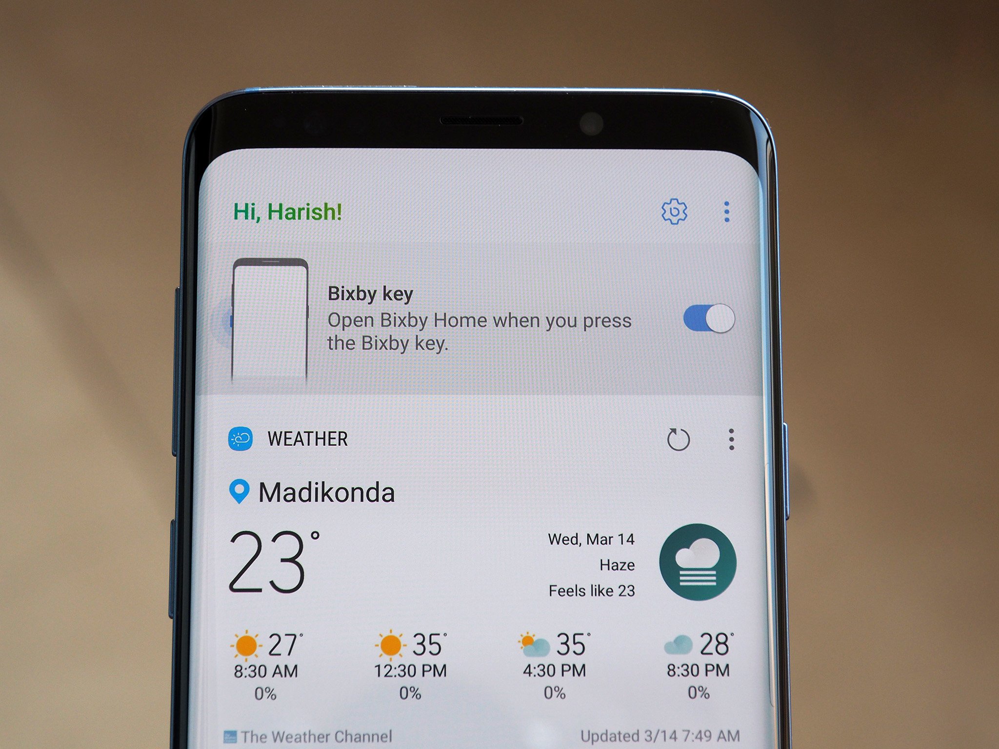
A year after Bixby made its debut, it still feels half-baked. You can get Google Assistant to perform most of the same tasks, but one area where Bixby shines is navigating the complex user interface. If you're looking for an option that's hidden under several layers of menus in the phone's settings or if you're interested in opening apps with voice commands, Bixby is relatively useful.
But for a majority of users, Bixby is another one of those services that needs disabling when setting up the S9 or S9+. What's particularly irksome about Bixby is that the service has a dedicated hardware button that can't be reconfigured for anything else — by disabling Bixby, you're essentially nullifying the button's functionality.
Having the option to launch another app or use it as a shutter button for the camera would be a valuable addition from a usability standpoint.
Getting rid of the legacy features
Samsung overhauled its user interface last year, and there haven't been many changes on that front with the Galaxy S9. If you've used a Samsung phone over the last 12 months, you'll feel at home with Samsung Experience 9.0.
Because Samsung is the largest Android manufacturer around, it needs to cater to a wide-reaching audience with varying usage patterns. Over the years, Samsung has added a ton of features to its interface, and although the design has received an overhaul, there are several legacy features still baked into the interface.
Ideally, it takes a few hours to set up the phone to your liking. It's great that Samsung offers a ton of customization options, but a lot of the legacy features aren't really that useful. For instance, Samsung has a duplicate set of apps for most Google services, and while features like swiping your palm across the edge of the display to take a screenshot sounds cool, it doesn't work most of the time and you're better off sticking to the usual method.
The interface doesn't feel anywhere near as fluid as that of the Pixel 2 or even the OnePlus 5T, which costs $300 less. To its credit, Samsung allows you to disable a lot of the pre-installed apps, but the fact that they're there is the main issue.
Bringing back the old camera interface
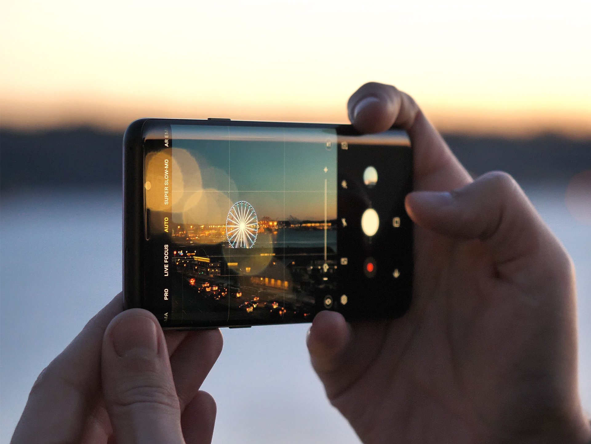
Alongside the new imaging sensors, Samsung overhauled the camera app, bringing an iOS-style interface that lets you can scroll through the available modes by swiping left and right. More often than not, you'll just end up switching shooting modes when you're trying to interact with the interface, like changing the focus or manually adjusting the exposure levels.
Your turn
How are you liking your Galaxy S9/S9+? Is there anything you'd like to change on your phone? Let me know in the comments.
from Android Central - Android Forums, News, Reviews, Help and Android Wallpapers http://ift.tt/2pvQw3i
via IFTTT


No comments:
Post a Comment