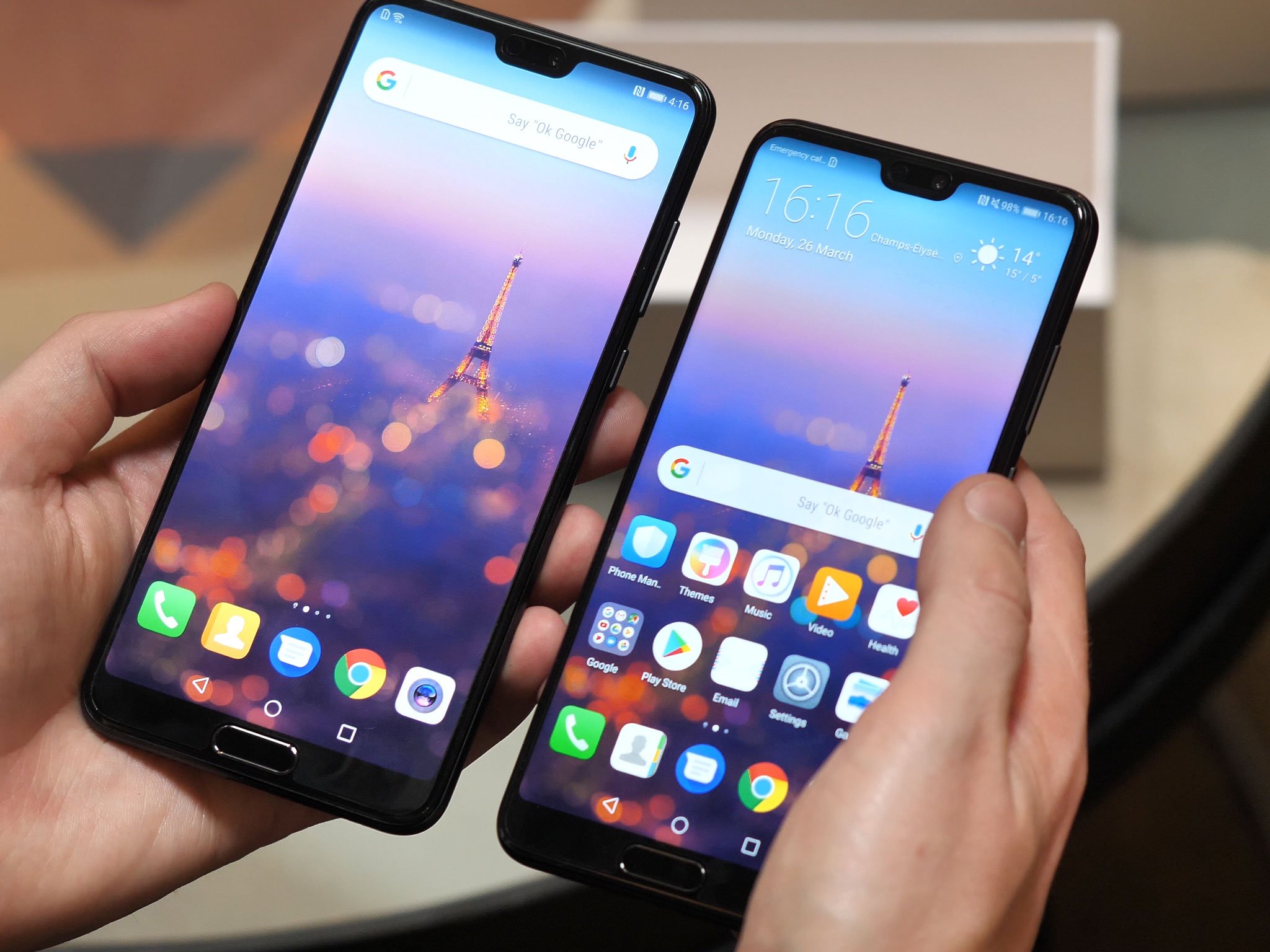
The answer may depend on if you're a glass-half-empty or half-full person.
After seeing a flood of notched Android phones at MWC, there's been a lot of talk about the benefits and disadvantages of having a cutout in a phone's display. The main idea is that by housing a phone's various sensors and earpiece speaker into a notch at the top of the display, OEMs are able to further slim down bezels and fit a larger screen on a smaller body.
To say the notch has been met with some backlash would be a severe understatement. While the main goal is to create more screen real estate for the user, many view the notch more as an obstacle than an add-on, and find the small display strips to the sides of the notch (also known as "bunny ears" or "horns," among other nicknames) largely useless.
Assuming a taller aspect ratio, a notch can add to a display's overall usable vertical space.
I understand that sentiment. With a notch as wide as the iPhone X's, there's little room for notification icons in the system tray — especially with most notched phones moving the clock to the left side where notifications typically reside. There's also less space to the right for system icons like WiFi and Bluetooth, meaning you may not be able to see certain information at a glance; on my iPhone X, for example, the battery icon is always in the upper-right corner, but I have to swipe down into Control Center to be able to check the actual battery percentage.
Maybe that's why most Android OEMs are using much smaller notches than the iPhone X. The newly announced Huawei P20 Pro has just enough room in its notch for the earpiece speaker and front-facing camera — Huawei even took a moment to brag during the phone's announcement about how small its notch is. Yes, really.
It’s come to this. pic.twitter.com/yP7cTdAdJZ
— Michael Kukielka (@DetroitBORG) March 27, 2018
Likewise, OnePlus has confirmed that the OnePlus 6 will feature a small notch, explaining that they see it as a means of adding screen space rather than taking it away, and I tend to agree with them. With enough room around the notch, you're still able to allocate the very top of the display for notifications, all while gaining a bit of vertical real estate — at least, assuming a taller aspect ratio. Fortunately, we've already seen evidence that the OnePlus 6 will have a 19:9 display, which should easily make up for the notch.
It's up to the user to decide whether the notch is a useful design trait or just an annoying gimmick — though a quick skim through the comments of my last notch-related article is all it takes to see that most Android users aren't particularly fond of it. Maybe that consensus will start to shift as more people get their hands on notched Android phones in the coming year, and as Google builds native notch support into Android P.
For now, what are your thoughts? Does the combination of a notch and a taller aspect ratio equal out to more vertical space for you, or is it still simply a design nuisance? Will it even matter this time next year, with nearly every flagship moving to a notched design anyway? Sound off in the comments!
from Android Central - Android Forums, News, Reviews, Help and Android Wallpapers https://ift.tt/2pPijvC
via IFTTT

No comments:
Post a Comment