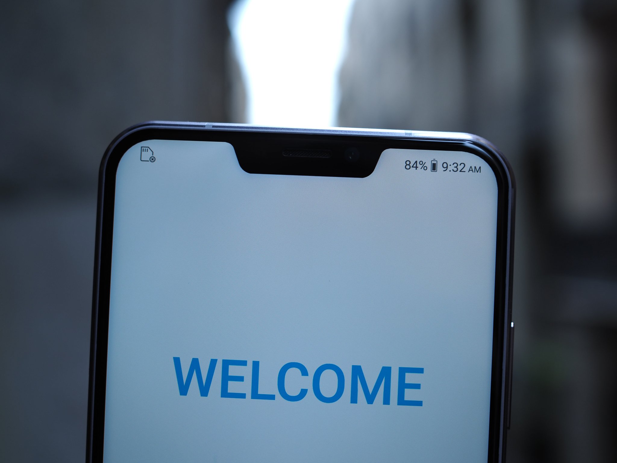
We're starting to see more phones with the dreaded notch, but what's the big deal?
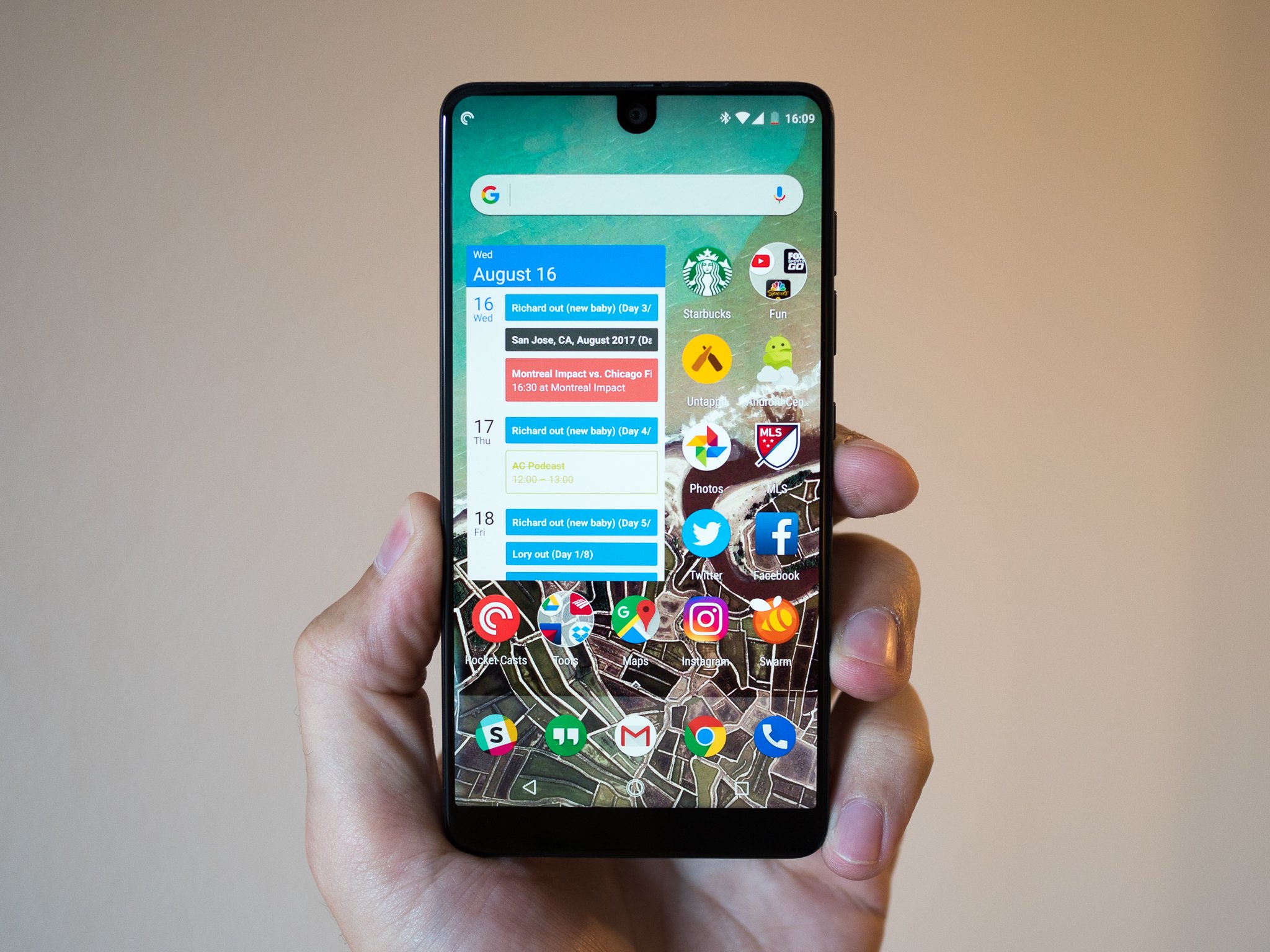
In the wake of newly announced phones like the ASUS Zenfone 5 and the rumored Huawei P20, there's been a lot of talk about the dreaded notch coming to more Android phones. A lot of people have pointed the blame at the iPhone X for starting this hardware trend, but while it's true that Apple has been the most high-profile notched phone as of yet, Essential was the first to cut out a portion of the display.
But what's the point of the notch in the first place? And doesn't it get in the way of certain apps and the phone's general interface?
Why the notch is there
As bezels are shrinking further and further down, manufacturers are starting to run out of room for the various sensors on a phone, like infrared, proximity, and the front-facing camera. While some OEMs have come to other solutions like retractable selfie cams, it seems that the easiest way to slim down the top bezel is with a notch; ideally one just big enough to house the phone's sensors while still leaving plenty of room to the sides for as much screen as possible.
The notch takes the place of a bezel above the display and helps reduce the overall height of a phone.
It cuts into the display, sure, but you're still getting far more real estate to work with than if the screen just stopped before the notch. This means more room for information — you don't have to scroll through a web page as often because there's more vertical space for the content to fill. You can suddenly see more of the app you're in while you're typing.
This is a benefit originally brought on by the elongated aspect ratio craze (18:9 and beyond), but that introduced a new issue: with a longer display comes a taller phone that's harder to hold or fit into a pocket. The notch brings slimmer vertical bezels, which helps cut down on that added height.
The notch isn't perfect, though
As many are quick to point out, though, the notch comes with its own set of problems. While it cuts down on bezels, that added screen real estate is sort of canceled out by the reduced space for the status bar up top. On the Essential Phone, whose notch simply houses the front-facing camera and takes up minimal space, that's not such a big deal; the status bar simply occupies more vertical space to match the notch, and the status bar works as usual.
On the iPhone X, however, there's significantly less room for icons up top, so the status bar has been rearranged and houses less information — you can't even see your battery percentage without accessing Control Center. Android phones have an even bigger risk of running out of room, since notifications each get their own individual icon in the status bar.
On the bright side, it's already confirmed that Android P will bring universal notch support to Android. While we don't know exactly what that'll look like just yet, it's good to see optimized software quickly following the hardware.
Not(ch) the end of the world
Like most new hardware trends, the notch comes with a set of pros and cons, and it likely isn't the perfect option for everyone — after all, some people still prefer bezels. Still, I personally don't mind the notch, even if it does get in the way of fullscreen videos.
What are your thoughts? Would you rock a phone with a notch — and do you already? Let us know in the comments below!
from Android Central - Android Forums, News, Reviews, Help and Android Wallpapers http://ift.tt/2FzPehr
via IFTTT


No comments:
Post a Comment