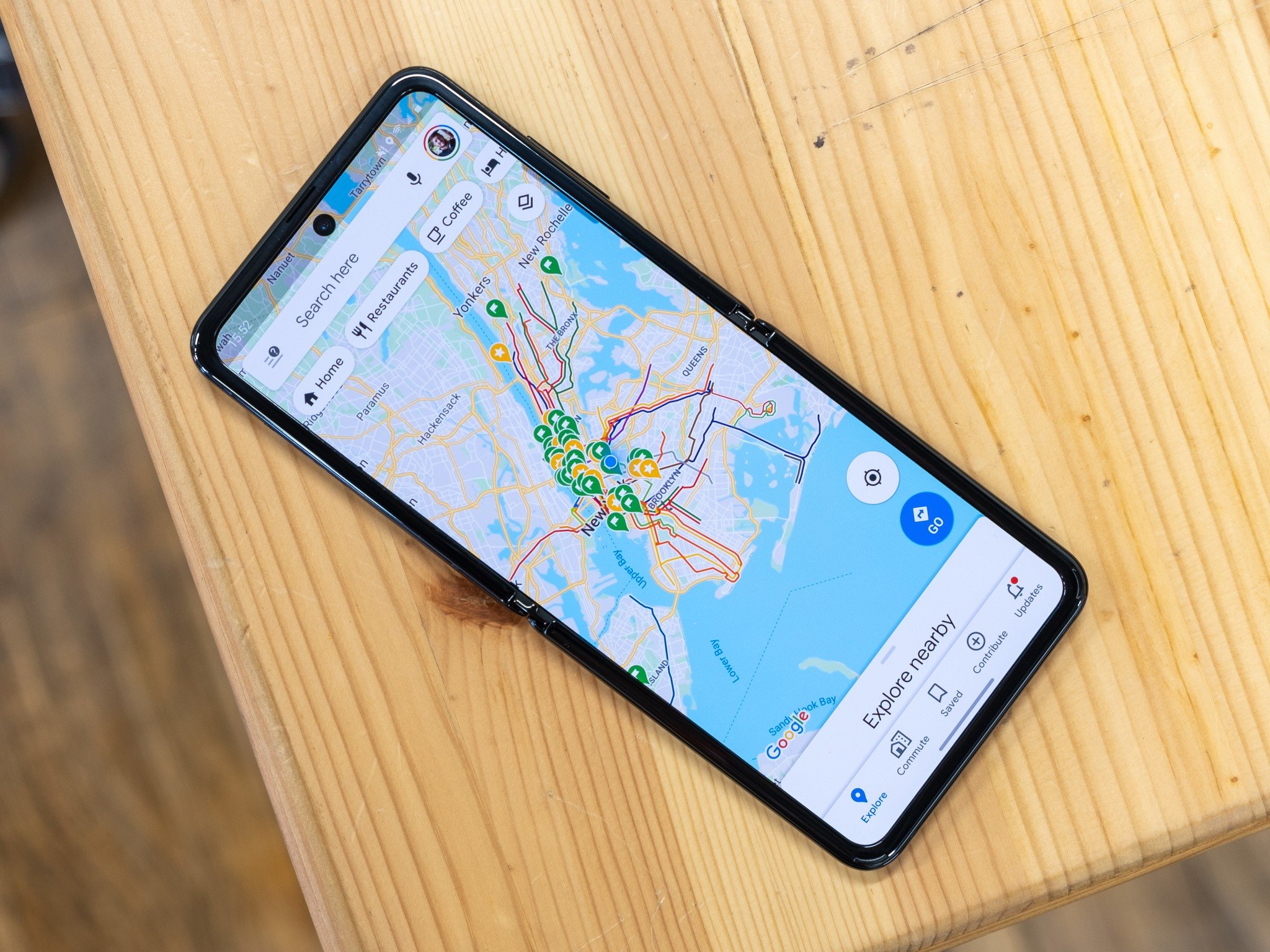
The new design should iron out the rough edges of the current dark mode.
What you need to know
- An examination of the Google Maps app for Android shows it's getting a reworked dark mode.
- While the app already has a dark mode, it only applies to the navigation mode, with other parts of the UI still featuring a bright background.
- The new design will fix that.
With dark mode updates for both Gboard, Google Chat, and Google Home in recent months, Google is finally getting the dark mode offerings for its first-party apps in order. The latest addition to this list is Google Maps, which, as an APK teardown of the app by 9to5Google reveals, is getting an upgraded dark mode.
The Maps app already has a semi-functional dark mode, but it currently only applies to the navigation mode and changes the background of the map to a darker shade. Aside from this, many other parts of the app's UI sport a bright background, and the code found in Version 10.50 of the app shows that's about to change.
The teardown reveals the addition of several new "night" assets, and strings found in the code show a new "Appearance" setting with options for "Dark theme," "Light Theme," and "Default to device theme." The latter will, much like the recent changes to the Gboard app, allow Maps to automatically switch themes based on your system-wide dark mode settings.
Notably, these options will be distinct from the appearance of the map in navigation mode, which is what the dark theme currently offers.
When these changes will take effect is anyone's guess, but given that parts of the code implementing it are already making their way into the Play Store builds of the app, we'd assume it's going to be sooner rather than later.
from Android Central - Android Forums, News, Reviews, Help and Android Wallpapers https://ift.tt/3hYOnWW
via IFTTT

No comments:
Post a Comment